
This business card project follows on from the initial logo design that was created a couple of months back. With the business cards requiring this branding, the vector logo files were opened up in Adobe Illustrator.

A new Illustrator document was created at the size of 88mm by 55mm, the standard size of business cards at the print firm I use. The color mode is set to CMYK for print purposes and raster effects at 300ppi (although no effects are used in this project it's worth remembering the setting).

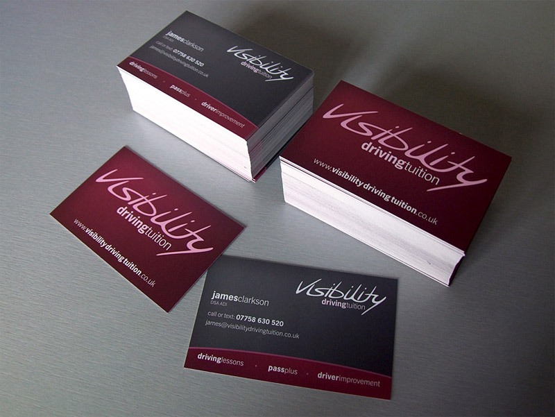
Being a print project the document required bleed at 3mm on each side of the document, therefore a rectangle of 94mm by 61mm was drawn and centred on the artboard. This was then filled with 45C, 100M, 55Y and 40K to continue forward the Visibility Driving Tuition brand colours.

To add a little visual interest and depth to the card a slight gradient effect was added using the Gradient Mesh Tool. The highlight was given the same colour swatch but minus the black (K) ink, this means there is a solid coat of cyan, magenta and yellow but the gradient of black giving the overall change in tone.

Before placing any text or content on the card, a set of guides were placed. A guide was positioned on each side of the artboard, then using the Move command they were positioned 5mm inwards.

The logo was placed on the front of the card, then scaled down to fit within the content area. Being sat on a dark background the logo needed a light colouring, pure white was too brash and contrasting so this was softened with 30% magenta.

The web address of the Visibility Driving Tuition website was then set in News Gothic, the font chosen as part of the Visibility branding. Using a mixture of light and bold variations the important section of the address was made to stand out.

Being an address of three parts a small amount of spacing was added between each word, this helps differentiate the three making it easier to read with a passing glance.

An 88x55mm rectangle was drawn and positioned centrally on the artboard, this was then used as a base for the crop marks using the Filter > Create > Crop Marks command.

With the front of the business card complete the file was saved.

The document was then stripped back to the basic structure, and a copy saved as the rear of the card on which the main details would be held.

Using a similar process, a grey rectangle was drawn (including bleed) using a fill of 80% black.

Using the Gradient Mesh tool, a single point at a lighter shade of 60% black was added to the top left corner. This again helps add a little depth and interest to the design. With the rear containing fine text, the single black ink ensured the printed reproduction was extremely crisp.

An area at the base of the card was to be sectioned to include the three main services, this was drawn using a large circle to produce a subtle curved edge.

Using a temporary rectangle at the size of the document the large circle was trimmed to size using the Pathfinder tool.

The colour scheme used on the front of the card was continued in this bottom area, adding a slight gradient across the width of the card and a thin stroke across the top edge.

The logo was placed onto the document and positioned within the margins in the top right corner.

The name, job title and contact details were then laid out in the chosen font. For the name in particular, the design style of the logo was continued through by setting the text in lowercase with a mixture of bold and light weights. After some feedback an alternate version was also created for comparison with normal capitalisation and spacing, but it was decided that the little tweaks added that little extra to the design and were carried forward.

The three main services of driving lessons, pass plus and driver improvement were added to the lower section using this same type style, aligning each one to the left, right and centre.

To separate each item, a small circular point was drawn, aligned with the text and filled with the colour swatch used on the stroke for consistency.

With the crop marks set in place the rear of the card was then complete. The design was soon approved and ready for printing. All text was converted to outlines to avoid font troubles.

Each file was then saved as an EPS.

The two EPS files were then converted to PDF files using Adobe Distiller's Press Quality setting.

To save sending two separate files, the two PDFs were then combined into one file using Adobe Acrobat.

With the two files combined into one high resolution print file the business card artwork was ready to be sent to print.

One final check was made using the Output Preview option within Adobe Acrobat by heading to Advanced > Print Production > Output Preview. Each plate can be viewed individually to check for stray colours and the reproduction of gradients. The Total Area Coverage also highlighted that there were no areas that risked over inking, with the exception of the crop marks that were set inregistration black.
for business card printing, contact: http://printcall.com/category.php?id_category=5
The files were packaged up and emailed to the printer, the order for 250 double sided cards with a matt lamination on both sides was placed.
In just a few days the cards arrived by post, all the colours looked fine, the text was nice and crisp and the gradients had been reproduced as planned, adding a nice soft variation of tone across each side of the card.
Image & details source: Spoongraphics, UK
Disclaimer: Images on this page are not owned by PrintCall.com and are used solely as design examples.