Thursday, June 28, 2012

Did You Know?


What are some factors you consider when designing, creating ads or building marketing material for you or your customer? Did you know that COLOR is a critical element in your design and it can trigger different types of emotions? For our message and designs to get through to our target audience we must implement the correct colors. Below is a list of commonly used colors along with the emotions they represent.


Red: Danger, excitement, fire, passion, blood, fight or flight.


Purple: Wealth, royalty, sophistication, intelligence.


Blue: Quietness, serenity, truth, dignity, constancy, reliability, power.


Black: Sophistication, elegance, power, rebellion.


White: Purity, cleanliness, luminosity, vacuum.


Yellow: Warmth, the sun for many cultures, brightness, joy if little saturated.


Green: Nature, fresh, vegetation, health. Green/blues are the favorites of consumers

Sunday, April 1, 2012

Excellent Ticket Design Samples


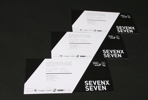
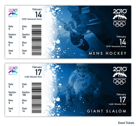
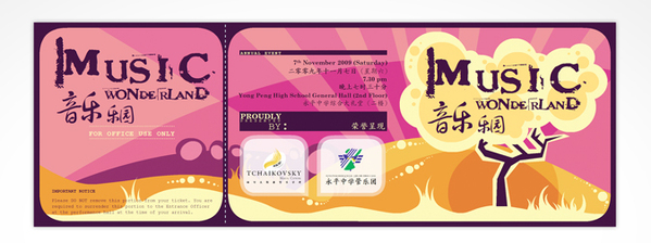
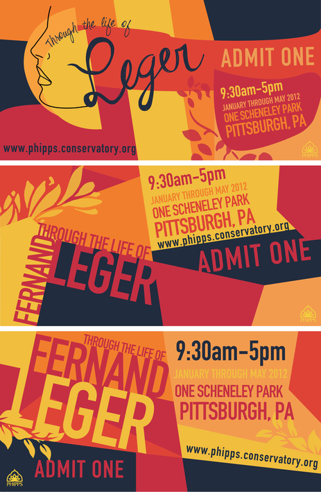
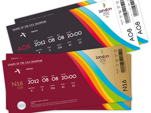
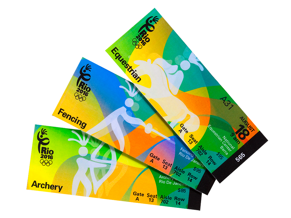
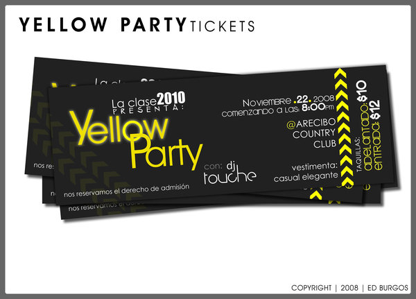
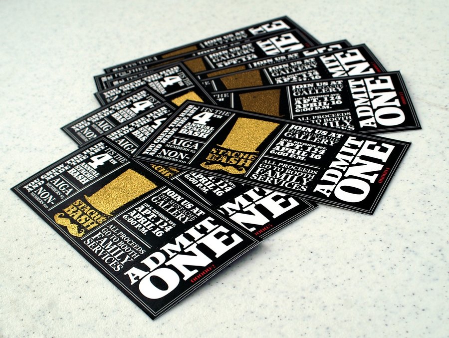
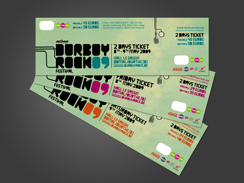
In the past, event tickets were primarily made to help the organizers control the inflow of guests in the venue. But with the advancement of printing technology, event tickets are now used for marketing purposes. In addition to the name, schedule and details of the event, logos of the sponsors are featured in the print. Typography and illustrations are also used to make the tickets look more attractive.
Since tickets can now be reserved days, weeks or even months from the actual event, they can also function as mini flyers. Ticket holders love to show off their tickets–we see this happening during friendly gatherings and in various forums in the internet.  An event ticket with a great design can certainly help fill seats.
If you’re an organizer and you want to maximize the effectivity of event tickets, it is ideal to useticket templates available in the internet. Having a reliable printing company such as PrintCall help you out with event ticket printing and designing is also crucial. Here are some of the reasons why:
1.  Unlike most companies, PrintCall gives customers the option of having their orders printed on either digital format (50-200 tickets) or offset format (500-10,000 tickets).
2.  They also do sequential numbering through a process called inkjetting that provides each ticket with a number unique to itself. Sequential numbering can be a huge help if organizers are planning to implement reserved seating, host raffles and make sure of the authenticity of the tickets held by guests.
3. Finally, PrintCall provides customers with the option to purchase tickets with perforations. Perforations are the tiny dotted holes (usually forming a straight line) on a paper, cardboard or plastic surface. The line composed of the perforations divides the ticket into 2 parts. One is usually collected by the organizers once the guest is allowed entry and the other can be kept as a souvenir.

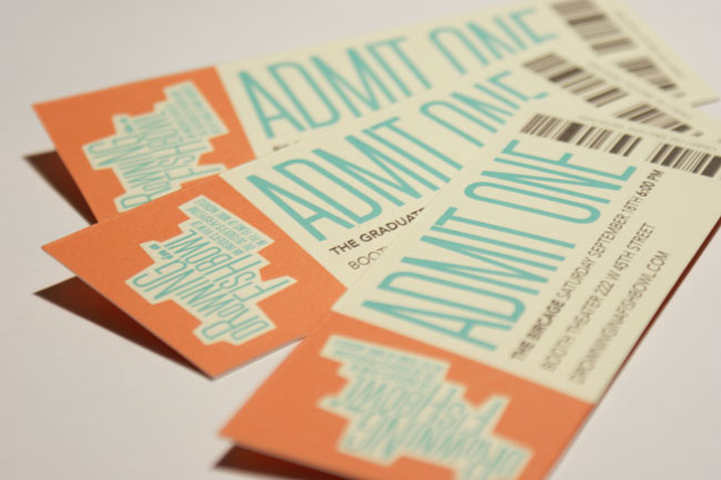
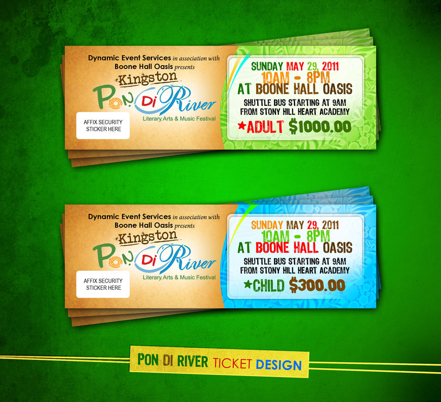
To help you to come up with a unique design for your event tickets, we have collected 32 excellent ticket design samples for your inspiration.
Disclaimer: Images on this page are not owned by PrintCall and are used solely as design examples. Please check bottom of the blog to see their original sources.

Excellent-Ticket-Design-01

Excellent-Ticket-Design-02

Excellent-Ticket-Design-03

Excellent-Ticket-Design-04

Excellent-Ticket-Design-05

Excellent-Ticket-Design-06

Excellent-Ticket-Design-07

Excellent-Ticket-Design-08

Excellent-Ticket-Design-09

Excellent-Ticket-Design-10

Excellent-Ticket-Design-11

Excellent-Ticket-Design-12

Excellent-Ticket-Design-13

Excellent-Ticket-Design-14

Excellent-Ticket-Design-15

Excellent-Ticket-Design-16

Excellent-Ticket-Design-17

Excellent-Ticket-Design-18

Excellent-Ticket-Design-19

Excellent-Ticket-Design-20

Excellent-Ticket-Design-21

Excellent-Ticket-Design-22

Excellent-Ticket-Design-23

Excellent-Ticket-Design-24

Excellent-Ticket-Design-25

Excellent-Ticket-Design-26

Excellent-Ticket-Design-27

Excellent-Ticket-Design-28

Excellent-Ticket-Design-29

Excellent-Ticket-Design-30

Excellent-Ticket-Design-31

Excellent-Ticket-Design-32


Going to host an event soon? With sequencing and perforations to consider, designing event tickets could be tricky and arduous.  For information regarding our printing services, please visit our websiteor call our business co-ordinator Mr. Manoj Jacob. (209) 624 3641  Email: manoj@printcall.com


Source:Www'dot'deviantart'dot'Com

Thursday, January 26, 2012

Icon design tutorial: How to make a Calendar icon


Disclaimer: The images on this page are not owned by PrintCall and are used solely as design examples. 
Please check bottom of post to see their original sources.
Final Look of the Calendar Icon
In the past few weeks we have received several e-mails from different users in which they were asking us if we could share a few tips regarding icon development. This tutorial is our reply to those users and a small contribution to all of you out there interested in icon development.
In this tutorial we're going to show you how we made the Calendar Icon from our most popular icon set “Coquette”.
Before you start developing your icon, you must first have a clear vision of how your icon will look. For a moment, step away from your computer and try to visualize your idea. Sketching on a piece of paper is very helpful in order to determine the design direction of the icon you are developing.
Skect of the Icon
The design idea behind this icon set is to create a very appealing, seductive look, one that can be used in all kinds of projects (websites, blogs, software, applications), and most importantly, a look that will bring a lot of attention and style to your projects.
In order to succeed the initial design idea, we need to keep the design very simple. We’ll be using rounded, curvy corners to achieve the cute feel, and strong, vibrant colors that will totally seduce our users.
Once you’re clear about the design course, you can start working on your computer. For the purposes of this article we'll be using Adobe Illustrator CS2.
From the Tools window select the Rectangle Tool and make a rectangle.
Selection of the Rectangle Tool and creation of a Rectangle
With the rectangle selected, choose Effect > Stylize > Round Corners, and give the rectangle a 23pt roundness.
Creating a Ractangle with Rounded Corners
Select the Gradient Tool and make a nice radial gradient using gray and white colors.
Applying Radial Gradient to the rectangle
Then go to Object > Expand Appearance.

We are now ready to make the holes for the calendar holders (that are going to be added a little later).
Select the Ellipse Tool and hold the Shift key to make a perfect circle. Select the circle and hold the Shift key to select the rectangle, as well. Then choose Window > Pathfinder>Trim. Repeat the same action for the second calendar hole.
The icon base is now ready.
Trimming the Rectangle
Applied Trim on the Rectangle
With our icon base created, we can proceed making the colored layer of the top part of the icon. Use the Copy and Paste action to duplicate the icon base. Select the Rectangle Tool and draw a rectangle over the area of the icon base object that you want to remove. Select both rectangle and the icon base and trim the duplicated object using the same Trim Tool from the Pathfinder, so we are left with only the top part of the icon.
Trimming the top part of the icon
Select the top part of the icon and use colorful gradient to get some really nice contrast. This time I’ll choose the linear gradient using strong red colors.
Applying red gradient to the icon
I now want to make the calendar holes stand our a bit. To do that I will add an additional circle with a stroke. Select the Ellipse Tool, to make the circle and choose a darker red color for the stroke.
Applying stroke to the icon holes
To make the calendar holders, select the Rectangle Tool to create the rectangle, and then make the corners round, same way as we did above. We also want to use a linear gradient for the holders object.
Creating Calendar Icon Holders
To be able to put some gradient on the stroke, I need to convert the stroke to an object.
Select the rectangle and go to Object > Expand Appearance, then choose Object > Path > Outline Stroke. Now we can put a gradient to the object.
Applying Gradient and Stroke
It’s time for the typography. Choosing the right font is a very important task. Since the icon design uses round corners, we think it will be most suitable to use a font with rounded corners. For the purposes of this tutorial I’m using a font called “Arial Rounded”.
So, select the Type Tool, and type the word you need.
Adding text to the Calendar Icon
Let’s make some circles using the Ellipse Tool. The circle objects will simulate the days of the month.
Adding Circle Deatils to the Calendar Icon
Using the same font, we're typing a desired date. The right font and color will surely give the icon a strong visual impact.
Adding Date as text to the Calendar Icon
A final touch is adding the glossy effect. Copy and Paste the red top of the icon twice. Then select the second copy with the first one, and trim it by using the Trim Tool, that way so you're left with just a small portion of the whole object. To get rid of the unnecessary holes create another rectangle right above them and select the rectangle with the glossy effect object, then trim it by using the Trim Tool again. Use a brighter red color to accent the effect.
Applying Glossy Effect to the Icon
Steps of applying the Glossy Effect to the Icon
We hope you enjoyed this article and it gave you some new ideas for creating web icons. Make sure to visit the DryIcons website regularly, lots of new features are yet to come.
Source:Www'dot'DryIcons'dot'Com